7. Seaborn#
7.1. Overview#
Seaborn is a high-level visualization library built on top of Matplotlib. It gives you cleaner defaults and concise plotting functions for statistical graphics, while still letting you use Matplotlib for fine-grained control. Pandas plotting is excellent for fast, direct plotting from a DataFrame. Seaborn becomes stronger when you need semantic mappings (color/style/size by variables), cleaner statistical defaults, and grouped comparisons.
Practical rules:
Start with Pandas for quick checks.
Use Seaborn for statistical/grouped visuals.
Drop to Matplotlib when you need exact low-level control.
As a comparison between the three visualization libraries:
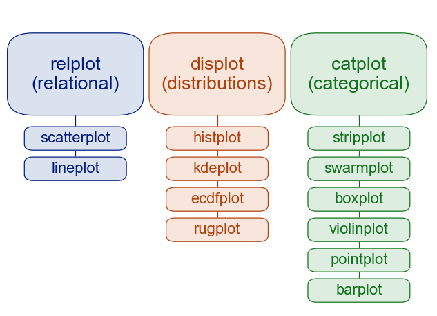
In this notebook, we will use the following learning path:
Quick start (first useful plots)
Data model and semantic mappings (
hue,style,size)Core seaborn plot families (distribution, relational, categorical)
Figure-level wrappers and faceting (
displot,relplot,catplot)Multivariate views (
pairplot,jointplot,heatmap)Optional KDE internals appendix
By convention, Seaborn is imported as sns:
import numpy as np
import pandas as pd
import matplotlib.pyplot as plt
# %pip install seaborn
import seaborn as sns

# Set consistent defaults for all following plots
sns.set_theme(style='whitegrid', context='notebook')

tips = sns.load_dataset('tips')
planets = sns.load_dataset('planets')
iris = sns.load_dataset('iris')
penguins = sns.load_dataset('penguins')
7.1.1. Quick Comparison#
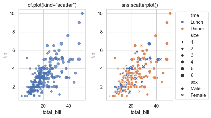
7.1.1.1. Seaborn vs. Pandas#
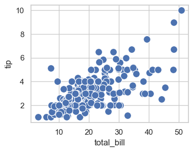
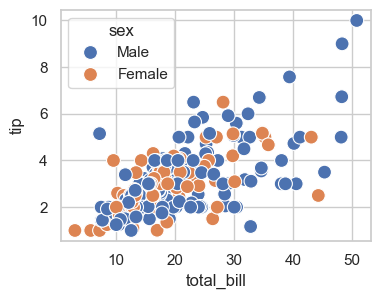
Compare the two plots in the next cells and you shall see that seaborn is giving more information about the data:
pd.plot.scatter(): fast DataFrame-first plotting.sns.scatterplot(): semantic mappings (hue,style,size) with cleaner statistical defaults.
Style note: this plot uses the global theme set earlier with sns.set_theme(style='whitegrid', context='notebook').
Both plots are placed side-by-side using plt.subplots(). The ax= parameter tells each plotting function which subplot panel to draw on — without it, every call would create its own separate figure.
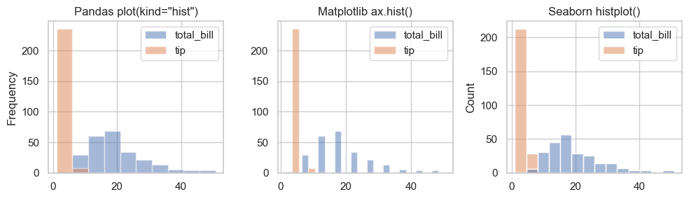
7.1.2. Comparing Libraries#
Compare histogram APIs across pandas, Matplotlib, and seaborn:
pandas: DataFrame-oriented convenience
Matplotlib: lower-level direct control
seaborn: statistical defaults and cleaner styling
fig, ax = plt.subplots(1, 3, figsize=(10, 3))

data = tips[['total_bill', 'tip']]
print(data.head())

### Pandas histogram
data.plot(kind='hist', title='Pandas plot(kind="hist")', ax=ax[0])

### Matplotlib histogram
ax[1].hist(data, label=['total_bill', 'tip'])
ax[1].set_title('Matplotlib ax.hist()')
ax[1].legend()

### Seaborn histogram
sns.histplot(data=data, ax=ax[2])
ax[2].set_title('Seaborn histplot()')

plt.tight_layout()
   total_bill   tip
0       16.99  1.01
1       10.34  1.66
2       21.01  3.50
3       23.68  3.31
4       24.59  3.61
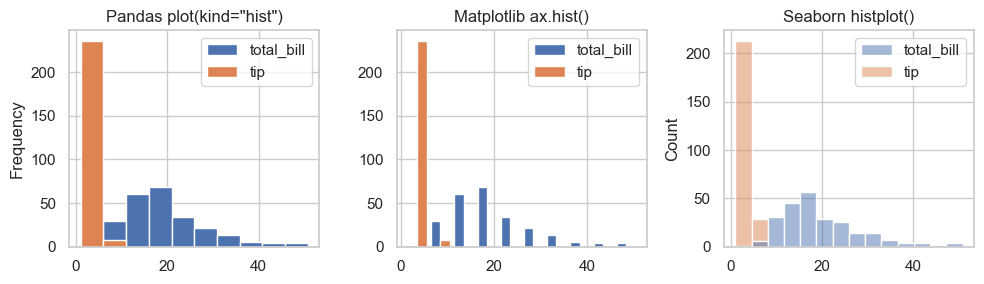
The histograms are different because:
Matplotlib and Pandas uses 10 bins by default; whereas Seaborn uses uses an automatic bin-width algorithm (Sturges or FD rule), which may produce more or fewer bins depending on the data distribution.
Matplotlib has relatively narrow bin width because we are passing a 2-column DataFrame directly to
ax.hist(), and Matplotlib is plotting each column as a separate histogram side-by-side each within half of the bin-width.The Seaborn plot has an default alpha (transparency) when the plots overlap.
The rule of thumb for choosing among the libraries: if you want a fast exploratory plot, Seaborn is more automatic; if you need precise control over bins, colors, and layout, Matplotlib gives you more flexibility.
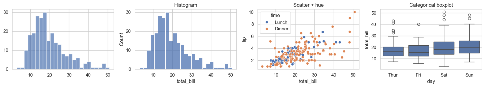
7.1.3. Plotting Methods Example#
Let’s start with a few axes-level examples. This gives you a fast way to recognize seaborn syntax before diving into API details. Here we see three different plotting functions of seaborn: histplot(), scatterplot(), and boxplot().
Let’s take a look at the tips dataset.
# df.loc[row_label, column_label]

tips.loc[:, ['total_bill', 'tip', 'size', 'day', 'time', 'sex']].head()
| total_bill | tip | size | day | time | sex | |
|---|---|---|---|---|---|---|
| 0 | 16.99 | 1.01 | 2 | Sun | Dinner | Female |
| 1 | 10.34 | 1.66 | 3 | Sun | Dinner | Male |
| 2 | 21.01 | 3.50 | 3 | Sun | Dinner | Male |
| 3 | 23.68 | 3.31 | 2 | Sun | Dinner | Male |
| 4 | 24.59 | 3.61 | 4 | Sun | Dinner | Female |
Using the MPL subplots() function, you can place the plots side-by-side. You can see that the seaborn syntax for calling the plotting functions is familiar but the method names are different. Here we have one plot created by MPL and three by seaborn.
fig, ax = plt.subplots(1, 4, figsize=(16, 3))

### Matplotlib
ax[0].hist(tips['total_bill'], bins=25, alpha=0.7)

### Seaborn
sns.histplot(data=tips, x='total_bill', bins=25, ax=ax[1])
ax[1].set_title('Histogram')

### Seaborn with hue
sns.scatterplot(data=tips, x='total_bill', y='tip', hue='time', ax=ax[2])
ax[2].set_title('Scatter + hue')

### Seaborn categorical plot
sns.boxplot(data=tips, x='day', y='total_bill', ax=ax[3])
ax[3].set_title('Categorical boxplot')

plt.tight_layout()
7.2. Seaborn Data Model and Semantic Mappings#
Seaborn works best with tidy (long-form) data:
each column is a variable
each row is one observation
Common semantic mappings:
hue: map category/value to colorstyle: map category to marker or line stylesize: map numeric values to marker size
Important distinction:
Use
size=...to map from dataUse
s=...for a constant marker size
7.2.1. Data Formats#
Data can be structured in different ways. Understanding these formats is essential because most Python visualization and analysis libraries, including Seaborn and pandas, expect data in a specific format. The common data formats are tidy, wide, and nested.
Format |
Best For |
|---|---|
Tidy |
Seaborn, statsmodels, most analysis |
Wide |
Excel, quick inspection, some ML models |
Nested |
Raw API/JSON data before processing |
In practice, data often arrives in wide or nested format and should be converted to tidy before visualization or analysis. For example, sns.barplot(data=df, x='category', y='value') assumes each row is one observation. If your DataFrame is wide (one column per category), Seaborn won’t work as expected and students will get confusing errors. So the practical point is: if a Seaborn plot looks wrong or throws an error, check whether your DataFrame is in tidy format first — and if not, use pd.melt() to reshape it.
7.2.2. Tidy (Long) Format#
In tidy data,
each row is one observation,
each column is one variable, and
each cell holds one value.
This is the preferred format for analysis and visualization.
import pandas as pd

tidy = pd.DataFrame({
    'student': ['Alice', 'Alice', 'Bob', 'Bob'],
    'subject': ['math', 'english', 'math', 'english'],
    'score':   [90, 85, 78, 88]
})
tidy
| student | subject | score | |
|---|---|---|---|
| 0 | Alice | math | 90 |
| 1 | Alice | english | 85 |
| 2 | Bob | math | 78 |
| 3 | Bob | english | 88 |
7.2.3. Wide Format#
In wide data,
each row represents one subject, and
variables are spread across multiple columns.
This format is easier for humans to read at a glance.
wide = pd.DataFrame({
    'student': ['Alice', 'Bob'],
    'math':    [90, 78],
    'english': [85, 88]
})
wide
| student | math | english | |
|---|---|---|---|
| 0 | Alice | 90 | 85 |
| 1 | Bob | 78 | 88 |
7.2.4. Nested Format#
Nested data stores values inside dictionaries or lists, common when loading from JSON or APIs. It must be flattened before use.
nested = {
    'Alice': {'math': 90, 'english': 85},
    'Bob':   {'math': 78, 'english': 88}
}
nested
{'Alice': {'math': 90, 'english': 85}, 'Bob': {'math': 78, 'english': 88}}
7.2.5. Converting Formats#
Wide vs. tidy data errors:
If you see KeyError: 'column_name', check if your DataFrame is in tidy format. Use pd.melt() to convert wide to tidy.
students = pd.DataFrame({
    'student': ['Alice', 'Bob', 'Carol', 'David', 'Eve'],
    'gender':  ['F', 'M', 'F', 'M', 'F'],
    'grade':   [10, 10, 11, 11, 12],
    'math':    [90, 78, 85, 72, 95],
    'english': [85, 88, 80, 76, 92],
    'science': [92, 80, 88, 70, 96]
})
print("Wide DataFrame:")
print(students, "\n")

# Wide --> Tidy
tidy = pd.melt(students,
               id_vars=['student', 'gender', 'grade'],
               var_name='subject',
               value_name='score')
print("Tidy DataFrame:")
print(tidy)

# Tidy --> Wide
wide = tidy.pivot(index='student',
                  columns='subject', values='score')

# Nested --> Tidy
# Cleaner Nested --> Tidy conversion
flat = pd.DataFrame(nested).T.reset_index()
flat.columns = ['student'] + list(flat.columns[1:])
flat = pd.melt(flat, id_vars='student',
               var_name='subject', value_name='score')
Wide DataFrame:
  student gender  grade  math  english  science
0   Alice      F     10    90       85       92
1     Bob      M     10    78       88       80
2   Carol      F     11    85       80       88
3   David      M     11    72       76       70
4     Eve      F     12    95       92       96

Tidy DataFrame:
   student gender  grade  subject  score
0    Alice      F     10     math     90
1      Bob      M     10     math     78
2    Carol      F     11     math     85
3    David      M     11     math     72
4      Eve      F     12     math     95
5    Alice      F     10  english     85
6      Bob      M     10  english     88
7    Carol      F     11  english     80
8    David      M     11  english     76
9      Eve      F     12  english     92
10   Alice      F     10  science     92
11     Bob      M     10  science     80
12   Carol      F     11  science     88
13   David      M     11  science     70
14     Eve      F     12  science     96
7.3. Figure vs. Axes-Level APIs#
Seaborn has two common usage patterns:
Figure-level functions (e.g.,
displot,relplot,catplot) manage an entire figure/grid and return grid objects (FacetGrid,JointGrid,PairGrid).Axes-level functions (e.g.,
histplot,scatterplot,lineplot,boxplot) draw on a specific Matplotlibaxand return anAxes. In other words, axes-level functions make self-contained plots.
Rule of thumb:
Use figure-level when faceting is the main goal.
Use axes-level for custom subplot composition.
The syntax for using seaborn is:
sns.PLOT-TYPE(data=df, x='col_a', y='col_b', hue='col_c')
      ↑           ↑         ↑          ↑          ↑
   plot type   DataFrame  x-axis     y-axis     color by
The table below summarizes common figure-level functions and their typical axes-level backends.
7.3.1. API Differences#
Aspect |
Figure-level |
Axes-level |
|---|---|---|
Returns |
|
|
Faceting |
Built-in via |
Not available — use |
Sizing |
|
|
Multiple panels |
Automatic grid from data |
|
Layering plots |
✗ Hard |
✓ Easy — multiple functions on same |
When to use |
Grouped/faceted views, small multiples |
Custom layouts, overlaying, single-axes control |
7.3.2. Function Reference#
Figure-level |
Axes-level Functions |
Typical use |
|---|---|---|
|
|
Distributions, histograms, KDE, ECDF |
|
|
Relationships and trends |
|
|
Categorical comparisons |
|
|
Bivariate plots with marginals and/or regression |
|
|
Pairwise relationships across variables |
7.4. Distribution Plots#
Distribution plots help you understand spread, skew, and shape of numerical variables.
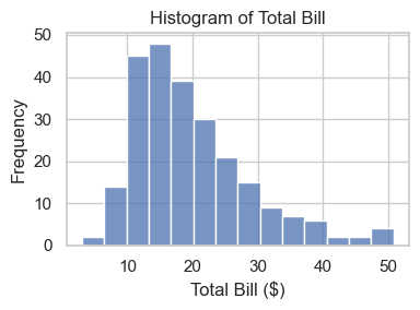
7.4.1. Histogram#
A histogram groups values into bins and shows frequency in each bin. histplot() is an axes-level function that returns an Axes object for further customization.
ax = sns.histplot(data=tips, x='total_bill')    ### sns.PLOT-TYPE(data=df, x='col_a', y='col_b', hue='col_c')
ax.set_title('Histogram of Total Bill')
ax.set_xlabel('Total Bill ($)')
ax.set_ylabel('Frequency')
ax.figure.set_size_inches(4, 3)
plt.tight_layout()
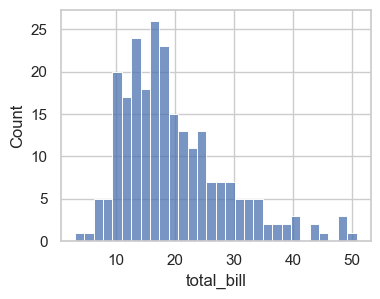
To control size, create an axes with Matplotlib and pass
ax=.Also, add
bins=gives you different widths for the bars. In this case, we change from the default number of bins to 30 and we see more information about this distribution.
fig, ax = plt.subplots(figsize=(4, 3))
sns.histplot(data=tips, x='total_bill', bins=30, ax=ax)
<Axes: xlabel='total_bill', ylabel='Count'>
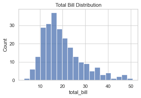
### Exercise: Histogram for Total Bill
#   1. Create a figure and axes with figsize=(5, 3).
#   2. Plot a histogram of tips['total_bill'] using sns.histplot.
#   3. Use bins=20.
#   4. Set the title to 'Total Bill Distribution'.
### Your code starts here.


### Your code ends here.
Text(0.5, 1.0, 'Total Bill Distribution')
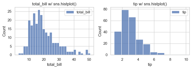
7.4.1.1. Bins, Alpha, and KDE#
Three common controls:
bins: granularity of histogram barsalpha: transparencykde=True: overlay smooth density estimate
fig, axes = plt.subplots(1, 2, figsize=(8, 3))
bins = [30, 10]
for i, col in enumerate(data.columns):
    sns.histplot(data[col], bins=bins[i], label=col, ax=axes[i])
    axes[i].set_title(f'{col} w/ sns.histplot()')
    axes[i].legend()
plt.tight_layout()
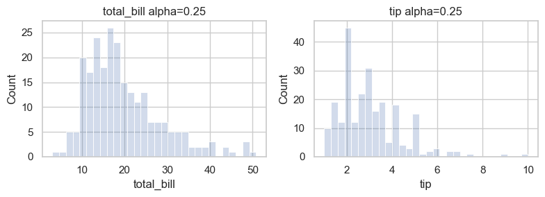
fig, axes = plt.subplots(1, 2, figsize=(8, 3))
for i, col in enumerate(data.columns[:2]):
    sns.histplot(data[col], alpha=0.25, bins=30, ax=axes[i])
    axes[i].set_title(f'{col} alpha=0.25')
plt.tight_layout()
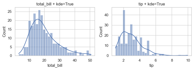
To overlay KDE, set keyword argument kde=True when plotting.
fig, axes = plt.subplots(1, 2, figsize=(8, 3))
for i, col in enumerate(data.columns):
    ### add kde=True for kernel density estimate overlay
    sns.histplot(data[col], alpha=0.5, bins=30, kde=True, ax=axes[i])
    axes[i].set_title(f'{col} + kde=True')
plt.tight_layout()
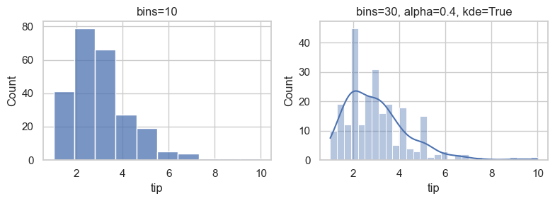
### Exercise: Compare Histogram Settings
#   1. Create fig, axes = plt.subplots(1, 2, figsize=(8, 3)).
#   2. On axes[0], plot tips['tip'] with bins=10 and title 'bins=10'.
#   3. On axes[1], plot tips['tip'] with bins=30, alpha=0.4, kde=True,
#      and title 'bins=30, alpha=0.4, kde=True'.
#   4. Call plt.tight_layout().
### Your code starts here.


### Your code ends here.
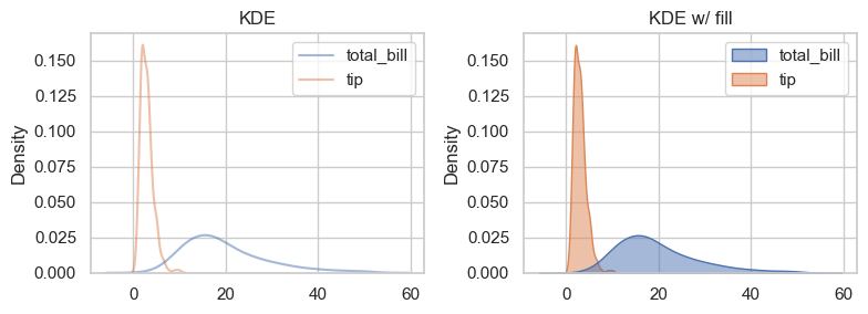
7.4.2. KDE / Density#
KDE is a smooth estimate of a distribution. It is often useful alongside histograms.
fig, axes = plt.subplots(1, 2, figsize=(8, 3))

sns.kdeplot(data=data, alpha=0.5, ax=axes[0])   ### seaborn ignores non-numeric columns, so no need to specify x or y
axes[0].set_title('KDE')

sns.kdeplot(data=data, alpha=0.5, ax=axes[1], fill=True)    ### add fill=True for filled KDE
axes[1].set_title('KDE w/ fill')

plt.tight_layout()
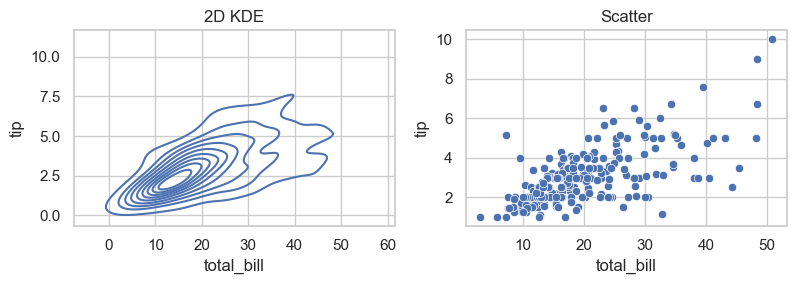
A 2D KDE is a smooth version of scatterplot.
fig, axes = plt.subplots(1, 2, figsize=(8, 3))

sns.kdeplot(data=data, x='total_bill', y='tip', ax=axes[0])  ### specify x and y for 2D KDE
axes[0].set_title('2D KDE')

sns.scatterplot(data=data, x='total_bill', y='tip', ax=axes[1])
axes[1].set_title('Scatter')

plt.tight_layout()
Here we use density plot as an example of how Pandas visualization differs, syntactically, from Matplotlib and Seaborn:
Library |
Function |
Notes |
|---|---|---|
Seaborn |
|
most common, easy to use |
Pandas |
|
convenient for quick plots |
Matplotlib + SciPy |
|
manual control over details |
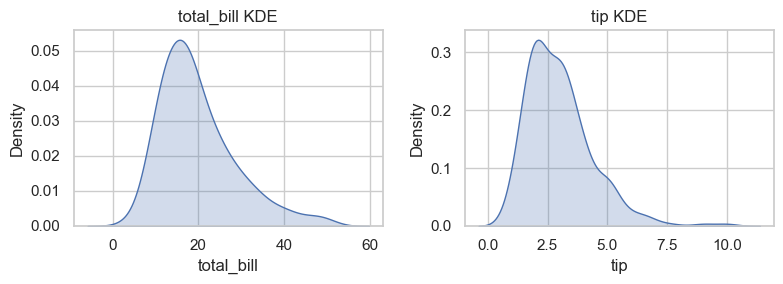
### Exercise: KDE for Two Variables
#   1. Create fig, axes = plt.subplots(1, 2, figsize=(8, 3)).
#   2. On axes[0], draw sns.kdeplot for tips['total_bill'] with fill=True.
#   3. On axes[1], draw sns.kdeplot for tips['tip'] with fill=True.
#   4. Title the plots 'total_bill KDE' and 'tip KDE'.
#   5. Call plt.tight_layout().
### Your code starts here.


### Your code ends here.
7.5. Relational Plots#
Relational plots show how variables move together (patterns, trends, clusters).
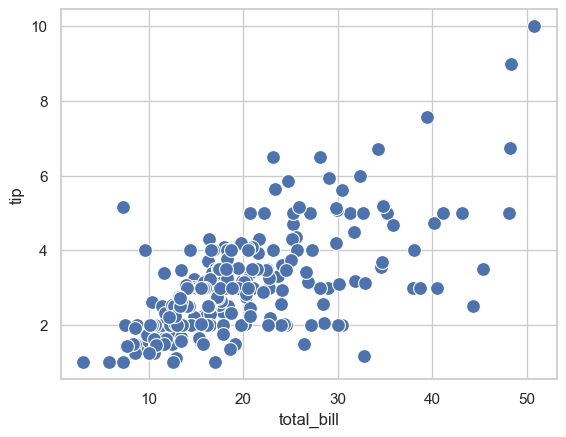
7.5.1. Scatter Plot#
sns.scatterplot(x='total_bill', y='tip', data=tips, s=100, legend=True)
<Axes: xlabel='total_bill', ylabel='tip'>
To control the figure size.
fig, ax = plt.subplots(figsize=(4, 3))
sns.scatterplot(x='total_bill', y='tip', data=tips, s=100, legend=True, ax=ax)
<Axes: xlabel='total_bill', ylabel='tip'>
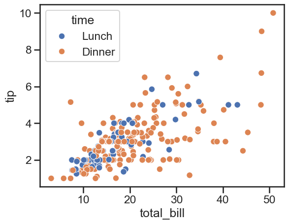
Add hue=
fig, ax = plt.subplots(figsize=(4, 3))
sns.scatterplot(x='total_bill', y='tip', data=tips, s=100, legend=True, ax=ax, hue='sex')
<Axes: xlabel='total_bill', ylabel='tip'>
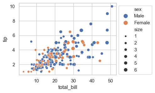
Add size and move legend out of the plot using bbox_to_anchor=. (*bbox == bounding box)
fig, ax = plt.subplots(figsize=(4, 3))
sns.scatterplot(x='total_bill', y='tip', data=tips, s=100, legend=True, ax=ax, hue='sex', size='size')
ax.legend(bbox_to_anchor=(1, 1))  ### move legend outside the plot
<matplotlib.legend.Legend at 0x11f057610>
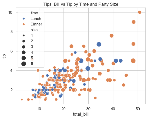
### Exercise: Scatter with Semantic Mapping
#   1. Create a scatter plot of total_bill vs tip.
#   2. Color points by time (hue='time').
#   3. Use marker size mapping from the 'size' column with sizes=(30, 180).
#   4. Set the title to 'Tips: Bill vs Tip by Time and Party Size'.
### Your code starts here.


### Your code ends here.
Text(0.5, 1.0, 'Tips: Bill vs Tip by Time and Party Size')
7.5.2. Line Plot#
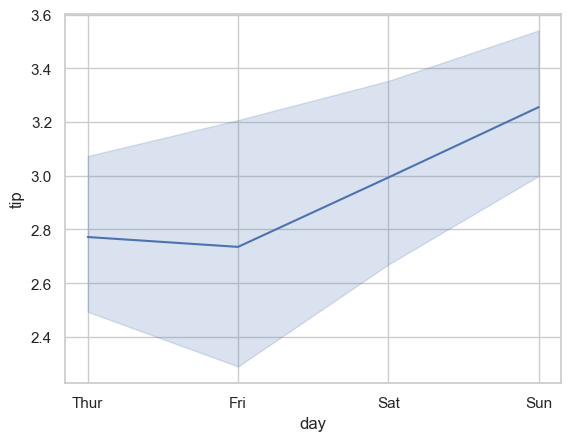
lineplot is commonly used for trends across an ordered x-axis. By default, seaborn aggregates repeated x values and can show uncertainty intervals.
sns.lineplot(x='day', y='tip', data=tips, estimator='mean', errorbar=('ci', 95))
<Axes: xlabel='day', ylabel='tip'>
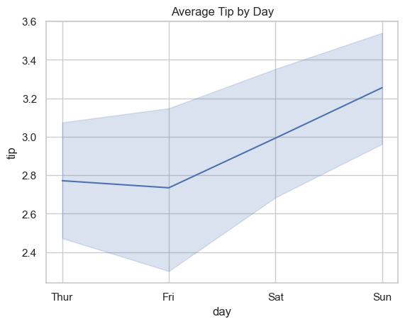
### Exercise: Average Tip by Day
#   1. Create a line plot with x='day' and y='tip' using the tips dataset.
#   2. Use estimator='mean'.
#   3. Keep a 95% confidence interval using errorbar=('ci', 95).
#   4. Set the title to 'Average Tip by Day'.
### Your code starts here.


### Your code ends here.
Text(0.5, 1.0, 'Average Tip by Day')
7.6. Categorical Plots#
Categorical plots summarize or compare values across groups.
sns.catplot() is a figure-level wrapper for categorical plots (kind='box', 'violin', 'bar', 'count', etc.).
Use it when you want consistent faceting/layout behavior across categorical plot types.
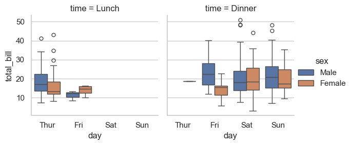
7.6.1. Box Plot#
Note
The with sns.axes_style(...) block is a context manager that temporarily applies a style only to the plots created inside it. Once the block ends, Seaborn reverts to the previous theme — nothing is permanently changed.
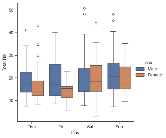
with sns.axes_style(style='ticks'):
    # g = sns.catplot(data=tips, x='day', y='total_bill', kind='box')
    g = sns.catplot(data=tips, x='day', y='total_bill', hue='sex', kind='box')
    g.set_axis_labels('Day', 'Total Bill')
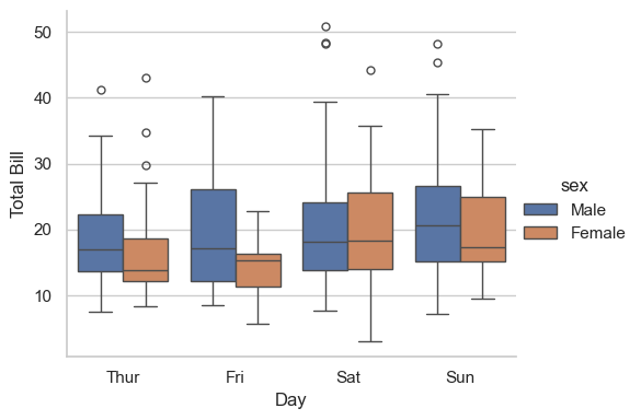
### Exercise: Box Plot by Day and Sex
#   1. Use sns.catplot with kind='box'.
#   2. Plot x='day', y='total_bill', and hue='sex' from tips.
#   3. Set axis labels to 'Day' and 'Total Bill'.
### Your code starts here.


### Your code ends here.
<seaborn.axisgrid.FacetGrid at 0x11e7c8e10>
7.6.2. Bar Plot#
bar shows an estimator (mean by default) with uncertainty intervals.
Also, here we explore different ways of plotting technics:
Saving axes: Instead of using
subplots(), we save the plot, which is an axes, and then control the styling directly.The
withstatement: Thewithstatement (the “context manager” that handles resources) temporarily applies a style only for the plots created inside its block. Once the block ends, Seaborn returns to the previous style — nothing is permanently changed.
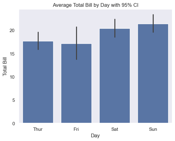
with sns.axes_style(style='dark'):
    g = sns.barplot(data=tips, x='day', y='total_bill', errorbar=('ci', 95))
    g.set_xlabel('Day')
    g.set_ylabel('Total Bill')
    g.set_title('Average Total Bill by Day with 95% CI')
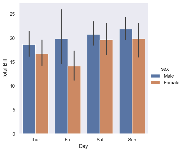
Set hue and see the magic seaborn does.
with sns.axes_style(style='dark'):
    g = sns.catplot(data=tips, x='day', y='total_bill', hue='sex', kind='bar', errorbar=('ci', 95))
    g.set_axis_labels('Day', 'Total Bill')
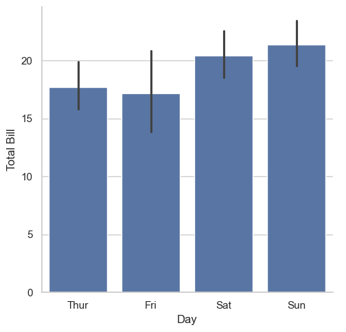
### Exercise: Mean Total Bill by Day
#   1. Create a categorical bar plot with x='day' and y='total_bill'.
#   2. Use kind='bar' and errorbar=('ci', 95).
#   3. Set axis labels to 'Day' and 'Total Bill'.
### Your code starts here.


### Your code ends here.
<seaborn.axisgrid.FacetGrid at 0x11ed860d0>
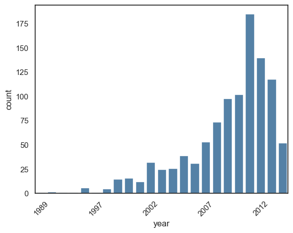
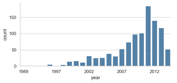
7.6.3. Count Plot (kind='count')#
Count plots show category frequencies. This is different from histograms, which bin continuous numeric values.
print(planets.head())

with sns.axes_style('white'):
    g = sns.countplot(
        data=planets,
        x='year',
        color='steelblue'
        )
    ticks = g.get_xticks()
    labels = [t.get_text() for t in g.get_xticklabels()]   # get labels before changing ticks

    g.set_xticks(ticks[::5])                    # set every 5th tick position
    g.set_xticklabels(labels[::5], rotation=45) # set every 5th label

### with figure level catplot:
# with sns.axes_style('white'):       ### with for temporary style
#     g = sns.catplot(
#         data=planets,
#         x='year',
#         aspect=2,           ### aspect ratio (width/height);
#         kind='count',
#         color='steelblue',
#         height=3
#     )
            method  number  orbital_period   mass  distance  year
0  Radial Velocity       1         269.300   7.10     77.40  2006
1  Radial Velocity       1         874.774   2.21     56.95  2008
2  Radial Velocity       1         763.000   2.60     19.84  2011
3  Radial Velocity       1         326.030  19.40    110.62  2007
4  Radial Velocity       1         516.220  10.50    119.47  2009
### Exercise: Count Planets Discoveries by Year
#   1. Create a count plot using planets with x='year'.
#   2. Use kind='count', height=3, aspect=2, and color='steelblue'.
#   3. Set x tick labels to show every 5th year.
### Your code starts here.


### Your code ends here.
<seaborn.axisgrid.FacetGrid at 0x11e8f3c50>
7.7. Figure-Level Wrappers and Faceting#
Use figure-level wrappers when you want seaborn to build panel grids directly from grouping variables.
These wrappers make small-multiple comparisons much easier (row=, col=, hue=, height=, aspect=).
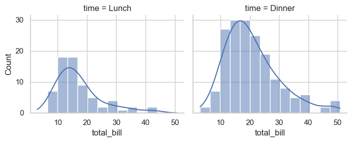
7.7.1. displot()#
The col= is set to time, meaning lunch and dinner. So we get two plots automatically.
tips.head(3)
| total_bill | tip | sex | smoker | day | time | size | |
|---|---|---|---|---|---|---|---|
| 0 | 16.99 | 1.01 | Female | No | Sun | Dinner | 2 |
| 1 | 10.34 | 1.66 | Male | No | Sun | Dinner | 3 |
| 2 | 21.01 | 3.50 | Male | No | Sun | Dinner | 3 |
sns.displot(data=tips, x='total_bill', col='time', kde=True, height=3, aspect=1.2)
<seaborn.axisgrid.FacetGrid at 0x11df22c10>
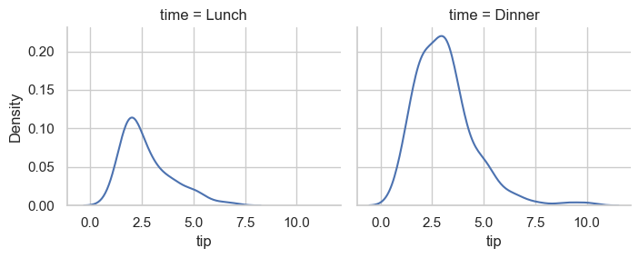
sns.displot(data=tips, kind='kde', x='tip', col='time', height=3, aspect=1.2)
<seaborn.axisgrid.FacetGrid at 0x11e771e50>
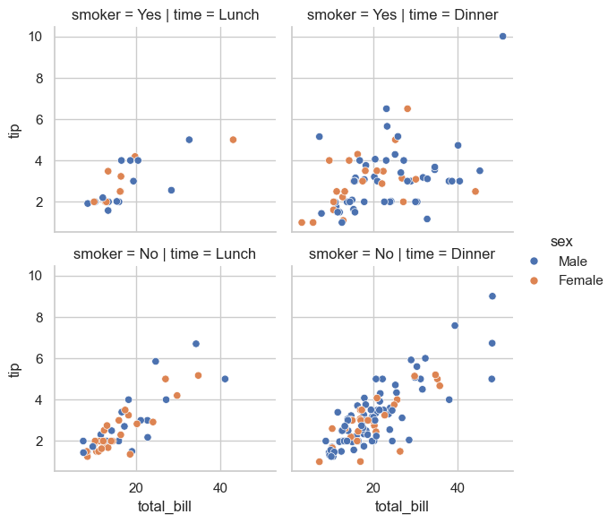
7.7.2. relplot()#
relplot() is a figure-level Seaborn function for relational data.
Parameter |
Value |
Effect |
|---|---|---|
|
|
Uses scatter plots |
|
|
Axes in each panel |
|
|
Point color encodes sex |
|
|
Separate columns for Lunch / Dinner |
|
|
Separate rows for Yes / No smoker |
|
|
Each facet is about 3×3 inches |
sns.relplot(
    data=tips,
    x='total_bill', y='tip',
    hue='sex', col='time', row='smoker',
    kind='scatter', height=3, aspect=1
)
<seaborn.axisgrid.FacetGrid at 0x11f276c10>
7.7.3. catplot()#
cat = sns.catplot(
    data=tips,
    x='day', y='total_bill', hue='sex', col='time',
    kind='box', height=3, aspect=1
)

type(cat)
seaborn.axisgrid.FacetGrid
7.8. FacetGrid#
FacetGrid is a return type and a standalone class by itself and can be used to create a FacetGrid directly.
After creating the FacetGrid, you use the map() function to pass plotting functions to it.
tips['tip_pct'] = 100 * tips['tip'] / tips['total_bill']

grid = sns.FacetGrid(data=tips, row='sex', col='time', margin_titles=True)
grid.map(plt.hist, 'tip_pct', bins=np.linspace(0, 40, 15))
<seaborn.axisgrid.FacetGrid at 0x11f3a2e90>
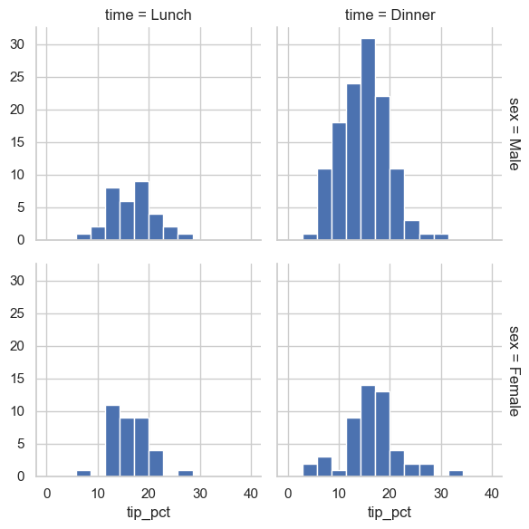
When to use FacetGrid vs. figure-level functions:
Use FacetGrid when you need:
Custom functions beyond Seaborn’s built-in plots
Multi-step plot construction (e.g.,
grid.map()multiple times)Fine control over individual facets
For standard faceting, displot(), relplot(), and catplot() are simpler and recommended.
### Exercise: Faceted Tip Percentage Histograms
#   1. Create tips['tip_pct'] as 100 * tip / total_bill.
#   2. Build a FacetGrid with row='sex' and col='time'.
#   3. Map plt.hist on 'tip_pct' using bins=np.linspace(0, 40, 15).
### Your code starts here.


### Your code ends here.
<seaborn.axisgrid.FacetGrid at 0x11f5bc550>
7.9. Multivariate Views#
These plots help you inspect relationships among multiple variables at once.
7.9.1. Pair Plots#
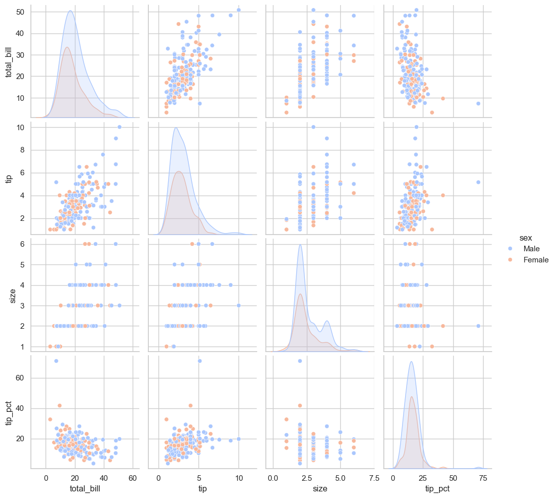
sns.pairplot(tips)
<seaborn.axisgrid.PairGrid at 0x11dd82660>

sns.pairplot(tips, hue='sex', palette='coolwarm')
<seaborn.axisgrid.PairGrid at 0x11fedead0>
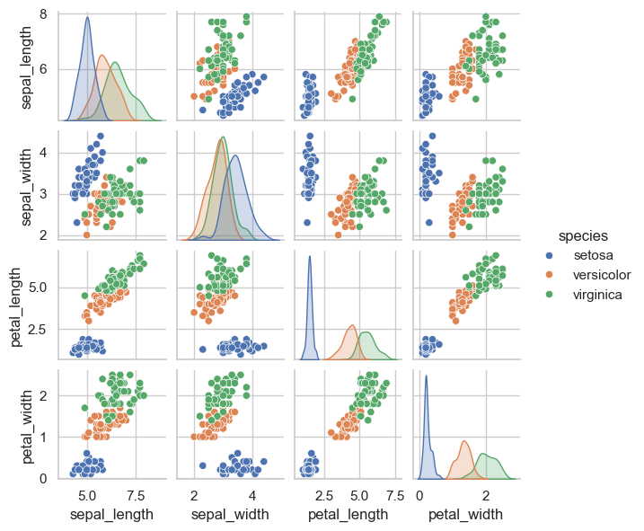
sns.pairplot(iris, hue='species', height=1.5)
<seaborn.axisgrid.PairGrid at 0x120569310>
### Exercise: Pairplot with Group Coloring
#   1. Create a pairplot using the iris dataset.
#   2. Color points by species using hue='species'.
#   3. Set height=1.5 for each subplot.
### Your code starts here.


### Your code ends here.
<seaborn.axisgrid.PairGrid at 0x11de06520>
7.9.2. Joint Plots#
### you may be tempted to do this, but it won't work because sns.jointplot creates its own figure and axes
# fig, ax = plt.subplots(1, 2, figsize=(8, 3))
# sns.jointplot(data=tips, x='total_bill', y='tip', kind='scatter', ax=ax[0])
# sns.jointplot(data=tips, x='total_bill', y='tip', kind='kde', fill=True, ax=ax[1])
###
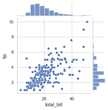
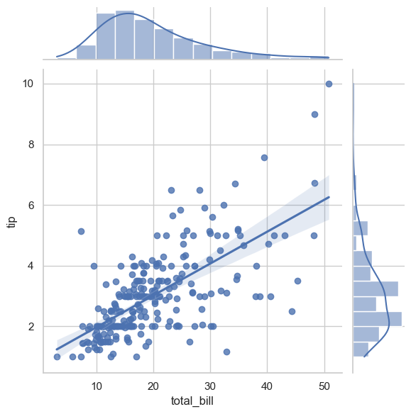
sns.jointplot(data=tips, x='total_bill', y='tip', kind='scatter', height=4)
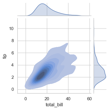
sns.jointplot(data=tips, x='total_bill', y='tip', kind='kde', fill=True, height=4)
<seaborn.axisgrid.JointGrid at 0x120f1a350>
with sns.axes_style('white'):
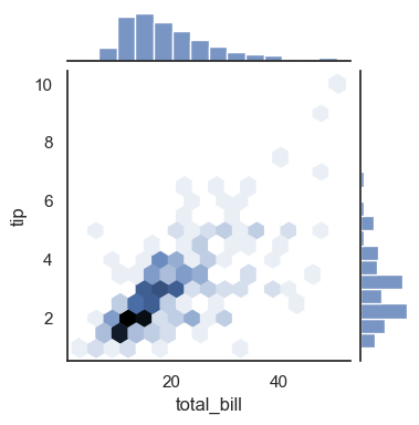
sns.jointplot(data=tips, kind='hex', x='total_bill', y='tip', height=4)
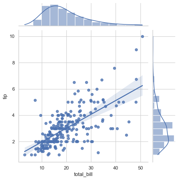
sns.jointplot(x='total_bill', y='tip', data=tips, kind='reg')
<seaborn.axisgrid.JointGrid at 0x11de07360>
### Exercise: Joint Plot with Regression
#   1. Create a joint plot of total_bill vs tip from tips.
#   2. Use kind='reg'.
#   3. Keep default marginal distributions.
### Your code starts here.


### Your code ends here.
<seaborn.axisgrid.JointGrid at 0x11de06b10>
7.9.3. Heatmap (Common EDA Pattern)#
Heatmaps are useful for compact matrix-style summaries, such as correlation matrices.
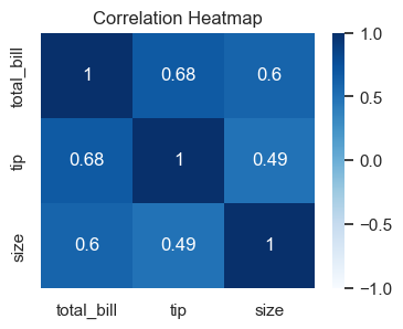
corr = tips[['total_bill', 'tip', 'size']].corr(numeric_only=True)

fig, ax = plt.subplots(figsize=(4, 3))
sns.heatmap(corr, annot=True, cmap='Blues', vmin=-1, vmax=1, ax=ax)
ax.set_title('Correlation Heatmap')
Text(0.5, 1.0, 'Correlation Heatmap')
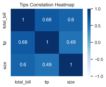
### Exercise: Correlation Heatmap
#   1. Compute a correlation matrix from ['total_bill', 'tip', 'size'].
#   2. Plot a heatmap with annot=True and cmap='Blues'.
#   3. Set vmin=-1 and vmax=1.
#   4. Add title 'Tips Correlation Heatmap'.
### Your code starts here.


### Your code ends here.
Text(0.5, 1.0, 'Tips Correlation Heatmap')
7.10. Themes and Global Style#
Seaborn theme settings apply globally in the notebook and help keep plots visually consistent.
sns.set_theme(style='ticks', context='talk', palette='deep')
sns.scatterplot(data=tips, x='total_bill', y='tip', hue='time')
<Axes: xlabel='total_bill', ylabel='tip'>
# Reset to a moderate default for the rest of your work
sns.set_theme(style='whitegrid', context='notebook')
To list all named palettes:
print(dir(sns.palettes))
['MPL_QUAL_PALS', 'QUAL_PALETTES', 'QUAL_PALETTE_SIZES', 'SEABORN_PALETTES', '_ColorPalette', '__all__', '__builtins__', '__cached__', '__doc__', '__file__', '__loader__', '__name__', '__package__', '__spec__', '_color_to_rgb', '_parse_cubehelix_args', '_patch_colormap_display', 'blend_palette', 'color_palette', 'colorsys', 'crayon_palette', 'crayons', 'cubehelix_palette', 'cycle', 'dark_palette', 'desaturate', 'diverging_palette', 'get_color_cycle', 'get_colormap', 'hls_palette', 'husl', 'husl_palette', 'light_palette', 'mpl', 'mpl_palette', 'np', 'set_color_codes', 'xkcd_palette', 'xkcd_rgb']
The commonly used built-in options are:
Qualitative (good for categories)
'deep', 'muted', 'pastel', 'bright', 'dark', 'colorblind'
Sequential
'Blues', 'Greens', 'Reds', 'Oranges', 'Purples', 'Greys'
Diverging
'coolwarm', 'RdBu', 'BrBG', 'PiYG'
Perceptually uniform
'viridis', 'plasma', 'magma', 'inferno', 'cividis'
To visually browse all palettes (most useful):
# See a single palette
sns.color_palette('deep')
# sns.color_palette('muted')
# Show a visual swatch in Jupyter
sns.palettes.SEABORN_PALETTES  # dict of all seaborn palettes
{'deep': ['#4C72B0',
  '#DD8452',
  '#55A868',
  '#C44E52',
  '#8172B3',
  '#937860',
  '#DA8BC3',
  '#8C8C8C',
  '#CCB974',
  '#64B5CD'],
 'deep6': ['#4C72B0', '#55A868', '#C44E52', '#8172B3', '#CCB974', '#64B5CD'],
 'muted': ['#4878D0',
  '#EE854A',
  '#6ACC64',
  '#D65F5F',
  '#956CB4',
  '#8C613C',
  '#DC7EC0',
  '#797979',
  '#D5BB67',
  '#82C6E2'],
 'muted6': ['#4878D0', '#6ACC64', '#D65F5F', '#956CB4', '#D5BB67', '#82C6E2'],
 'pastel': ['#A1C9F4',
  '#FFB482',
  '#8DE5A1',
  '#FF9F9B',
  '#D0BBFF',
  '#DEBB9B',
  '#FAB0E4',
  '#CFCFCF',
  '#FFFEA3',
  '#B9F2F0'],
 'pastel6': ['#A1C9F4', '#8DE5A1', '#FF9F9B', '#D0BBFF', '#FFFEA3', '#B9F2F0'],
 'bright': ['#023EFF',
  '#FF7C00',
  '#1AC938',
  '#E8000B',
  '#8B2BE2',
  '#9F4800',
  '#F14CC1',
  '#A3A3A3',
  '#FFC400',
  '#00D7FF'],
 'bright6': ['#023EFF', '#1AC938', '#E8000B', '#8B2BE2', '#FFC400', '#00D7FF'],
 'dark': ['#001C7F',
  '#B1400D',
  '#12711C',
  '#8C0800',
  '#591E71',
  '#592F0D',
  '#A23582',
  '#3C3C3C',
  '#B8850A',
  '#006374'],
 'dark6': ['#001C7F', '#12711C', '#8C0800', '#591E71', '#B8850A', '#006374'],
 'colorblind': ['#0173B2',
  '#DE8F05',
  '#029E73',
  '#D55E00',
  '#CC78BC',
  '#CA9161',
  '#FBAFE4',
  '#949494',
  '#ECE133',
  '#56B4E9'],
 'colorblind6': ['#0173B2',
  '#029E73',
  '#D55E00',
  '#CC78BC',
  '#ECE133',
  '#56B4E9']}
# Or use matplotlib's colormaps too
import matplotlib.pyplot as plt
plt.colormaps()  # lists all matplotlib-compatible names
['magma',
 'inferno',
 'plasma',
 'viridis',
 'cividis',
 'twilight',
 'twilight_shifted',
 'turbo',
 'berlin',
 'managua',
 'vanimo',
 'Blues',
 'BrBG',
 'BuGn',
 'BuPu',
 'CMRmap',
 'GnBu',
 'Greens',
 'Greys',
 'OrRd',
 'Oranges',
 'PRGn',
 'PiYG',
 'PuBu',
 'PuBuGn',
 'PuOr',
 'PuRd',
 'Purples',
 'RdBu',
 'RdGy',
 'RdPu',
 'RdYlBu',
 'RdYlGn',
 'Reds',
 'Spectral',
 'Wistia',
 'YlGn',
 'YlGnBu',
 'YlOrBr',
 'YlOrRd',
 'afmhot',
 'autumn',
 'binary',
 'bone',
 'brg',
 'bwr',
 'cool',
 'coolwarm',
 'copper',
 'cubehelix',
 'flag',
 'gist_earth',
 'gist_gray',
 'gist_heat',
 'gist_ncar',
 'gist_rainbow',
 'gist_stern',
 'gist_yarg',
 'gnuplot',
 'gnuplot2',
 'gray',
 'hot',
 'hsv',
 'jet',
 'nipy_spectral',
 'ocean',
 'pink',
 'prism',
 'rainbow',
 'seismic',
 'spring',
 'summer',
 'terrain',
 'winter',
 'Accent',
 'Dark2',
 'Paired',
 'Pastel1',
 'Pastel2',
 'Set1',
 'Set2',
 'Set3',
 'tab10',
 'tab20',
 'tab20b',
 'tab20c',
 'grey',
 'gist_grey',
 'gist_yerg',
 'Grays',
 'magma_r',
 'inferno_r',
 'plasma_r',
 'viridis_r',
 'cividis_r',
 'twilight_r',
 'twilight_shifted_r',
 'turbo_r',
 'berlin_r',
 'managua_r',
 'vanimo_r',
 'Blues_r',
 'BrBG_r',
 'BuGn_r',
 'BuPu_r',
 'CMRmap_r',
 'GnBu_r',
 'Greens_r',
 'Greys_r',
 'OrRd_r',
 'Oranges_r',
 'PRGn_r',
 'PiYG_r',
 'PuBu_r',
 'PuBuGn_r',
 'PuOr_r',
 'PuRd_r',
 'Purples_r',
 'RdBu_r',
 'RdGy_r',
 'RdPu_r',
 'RdYlBu_r',
 'RdYlGn_r',
 'Reds_r',
 'Spectral_r',
 'Wistia_r',
 'YlGn_r',
 'YlGnBu_r',
 'YlOrBr_r',
 'YlOrRd_r',
 'afmhot_r',
 'autumn_r',
 'binary_r',
 'bone_r',
 'brg_r',
 'bwr_r',
 'cool_r',
 'coolwarm_r',
 'copper_r',
 'cubehelix_r',
 'flag_r',
 'gist_earth_r',
 'gist_gray_r',
 'gist_heat_r',
 'gist_ncar_r',
 'gist_rainbow_r',
 'gist_stern_r',
 'gist_yarg_r',
 'gnuplot_r',
 'gnuplot2_r',
 'gray_r',
 'hot_r',
 'hsv_r',
 'jet_r',
 'nipy_spectral_r',
 'ocean_r',
 'pink_r',
 'prism_r',
 'rainbow_r',
 'seismic_r',
 'spring_r',
 'summer_r',
 'terrain_r',
 'winter_r',
 'Accent_r',
 'Dark2_r',
 'Paired_r',
 'Pastel1_r',
 'Pastel2_r',
 'Set1_r',
 'Set2_r',
 'Set3_r',
 'tab10_r',
 'tab20_r',
 'tab20b_r',
 'tab20c_r',
 'grey_r',
 'gist_grey_r',
 'gist_yerg_r',
 'Grays_r',
 'rocket',
 'rocket_r',
 'mako',
 'mako_r',
 'icefire',
 'icefire_r',
 'vlag',
 'vlag_r',
 'flare',
 'flare_r',
 'crest',
 'crest_r']
7.11. Why KDE Looks Smooth#
This section is optional and focuses on intuition for KDE construction.
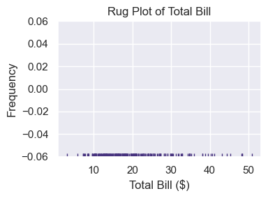
rugplot marks each observation on one axis. A KDE can be viewed as the sum of many smooth kernels centered on those observations.
sns.set_theme(palette='viridis')

ax = sns.rugplot(tips['total_bill'])
ax.set_title('Rug Plot of Total Bill')
ax.set_xlabel('Total Bill ($)')
ax.set_ylabel('Frequency')

ax.figure.set_size_inches(4, 3)
plt.tight_layout()
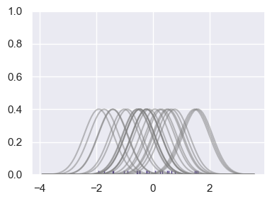
# Don't worry about understanding this code in depth.
# It visualizes how summing basis functions forms a KDE-like curve.
from scipy import stats

# Create dataset
np.random.seed(42)
dataset = np.random.randn(25)

ax = sns.rugplot(dataset)

x_min = dataset.min() - 2
x_max = dataset.max() + 2
x_axis = np.linspace(x_min, x_max, 100)

bandwidth = ((4 * dataset.std()**5) / (3 * len(dataset)))**.2

kernel_list = []
for data_point in dataset:
    kernel = stats.norm(data_point, bandwidth).pdf(x_axis)
    kernel_list.append(kernel)

    kernel = kernel / kernel.max()
    kernel = kernel * .4
    plt.plot(x_axis, kernel, color='grey', alpha=0.5)

plt.ylim(0, 1)

ax.figure.set_size_inches(4, 3)
plt.tight_layout()
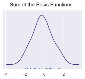
sum_of_kde = np.sum(kernel_list, axis=0)
plt.figure(figsize=(4, 3))
plt.plot(x_axis, sum_of_kde)
sns.rugplot(dataset)
plt.yticks([])
plt.suptitle('Sum of the Basis Functions');
7.12. Styling#
sns.set_theme(style='whitegrid', context='notebook')
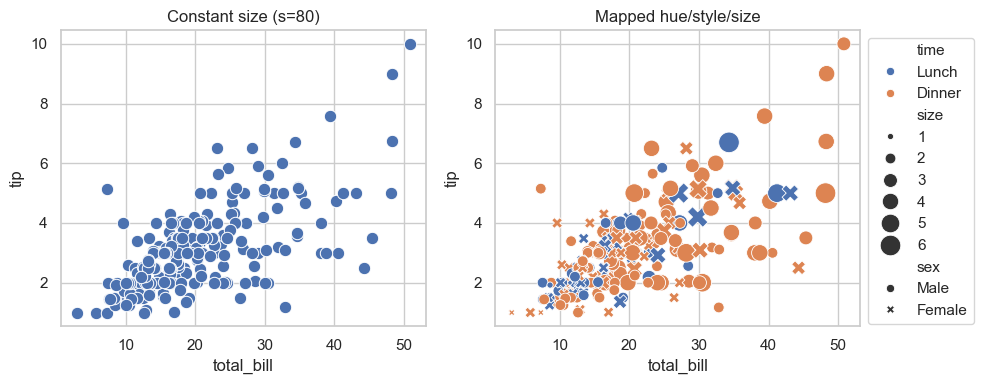
7.12.1. Size#
The size= and s= parameters are different parameters.
size=is not a parameter, it’s for semantic mapping. For example,size='size'mapssizefrom data column size.s=sets constant size across all points.
sns.scatterplot(data=tips, x=total_bill, y=tip, s=100)
sns.scatterplot(data=tips, x=total_bill, y=tip, size='size')
fig, ax = plt.subplots(1, 2, figsize=(10, 4))

# constant size points
sns.scatterplot(data=tips, x='total_bill', y='tip', s=80, ax=ax[0])
ax[0].set_title('Constant size (s=80)')

# size mapped from a real numeric column in the dataframe
sns.scatterplot(
    data=tips, x='total_bill', y='tip',
    hue='time', style='sex', size='size', sizes=(20, 220),
    ax=ax[1]
)
ax[1].set_title('Mapped hue/style/size')
ax[1].legend(bbox_to_anchor=(1, 1))  ### move legend outside the plot

plt.tight_layout()
7.12.2. Alpha#
Seaborn’s histplot() intelligently applies transparency when plotting multiple overlapping distributions. It detects overlapping series and applies transparency automatically so both are visible—one of Seaborn’s key advantages over Pandas and Matplotlib.
Pandas
plot(kind="hist")— overlaps with no transparency, you must setalpha=manuallyMatplotlib
ax.hist()— same, manualalpha=requiredSeaborn
histplot()— handles transparency automatically for overlapping series
data = tips[['total_bill', 'tip']]

fig, ax = plt.subplots(1, 3, figsize=(10, 3))

### Pandas histogram
data.plot(ax=ax[0], kind='hist', title='Pandas plot(kind="hist")', alpha=0.5)

### Matplotlib histogram
ax[1].hist(data, label=['total_bill', 'tip'], alpha=0.5)
ax[1].set_title('Matplotlib ax.hist()')
ax[1].legend()

### Seaborn histogram
sns.histplot(data=data, ax=ax[2])
ax[2].set_title('Seaborn histplot()')

plt.tight_layout()
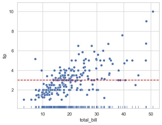
7.12.3. Overlay#
When combining multiple plot types, axes-level functions give you full control. On the other hand, figure-level functions create their own figure, making layering harder. Note that the three plots are all rendered on the same MPL axes object (ax).
ax.axhline() adds a horizontal line spanning the whole or fraction of the Axes. (see matplotlib.pyplot.axhline ). The basic syntax of axhline() is:
ax.axhline(y=0, xmin=0, xmax=1, **kwargs)
Commonly used parameters for ax.axhlin() include:
Parameter |
Meaning |
|---|---|
|
y-value where the horizontal line is drawn |
|
start of the line (fraction of axis width, 0–1) |
|
end of the line (fraction of axis width, 0–1) |
|
styling options like |
fig, ax = plt.subplots()
sns.scatterplot(data=tips, x='total_bill', y='tip', ax=ax)
sns.rugplot(data=tips, x='total_bill', ax=ax)                   # Add rug marks
ax.axhline(y=tips['tip'].mean(), color='red', linestyle='--')   # Add reference
<matplotlib.lines.Line2D at 0x12182f4d0>