5. Visualization#
Dr. Andrew Abela created this chart chooser visualization in 2013. The four-dimension chart categorization offer great insight when choosing visualizations.
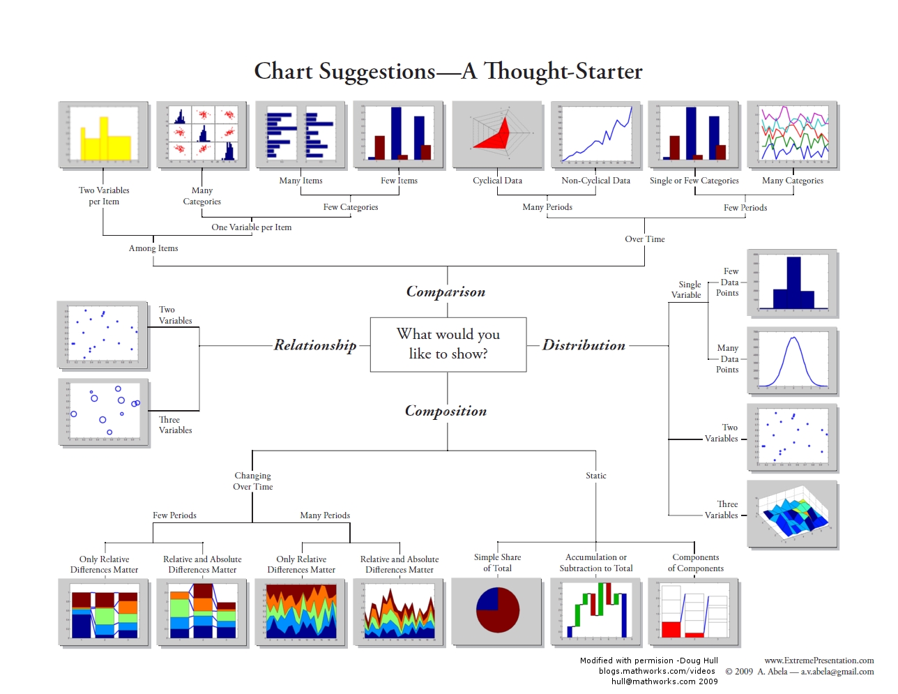
Fig. 5.1 Andrew Abela Chart Chooser #
import numpy as np
import pandas as pd
import matplotlib.pyplot as plt
import seaborn as sns
Overview
Data visualization is the art and science of transforming raw numbers into compelling visual stories. While spreadsheets and statistical summaries provide precise information, visualizations reveal patterns, relationships, and insights that would remain hidden in tables of data.
Imagine trying to understand weather patterns from thousands of temperature readings versus seeing them plotted as a line graph over time—the visual immediately shows trends, seasonal cycles, and anomalies that numbers alone cannot convey.
Each tool has its strengths: Python excels in programmatic control and integration with data analysis workflows, while R provides statistical visualization excellence, while Tableau and Power BI offer user-friendly interfaces for business users.
Why Visualization is Essential
Data visualization transforms numbers into understanding, serving three fundamental purposes:
Exploration and Discovery: Visualization reveals patterns, outliers, and relationships invisible in raw data, guiding initial analysis and data cleaning decisions.
Communication and Persuasion: Well-crafted visuals convey complex findings to diverse audiences, translating technical results into accessible insights.
Decision Support and Action: Visualization provides clarity for confident decision-making through dashboards, trend analysis, and comparative displays.
Ultimately, visualization bridges the gap between data analysis and actionable insight.
Effective data visualization follows four key principles:
Context is Key: Design for your specific audience and their decision-making needs.
Keep It Simple: Use clear labels and remove unnecessary elements that don’t add value.
Choose the Right Chart Type: Match chart types to data structure:
bars for categories,
lines for trends,
scatter plots for relationships.
Tell a Story: Structure visualizations to guide the audience through a logical narrative flow.
Common Tools and Libraries
The data visualization landscape offers tools ranging from point-and-click platforms to code-based libraries. Understanding this ecosystem helps you choose the right tool for your needs.
Business Intelligence Platforms:
Tableau: Industry-leading dashboard creation with drag-and-drop interface
Power BI: Microsoft’s analytics platform with strong Excel and cloud integration
Python Visualization Libraries:
Matplotlib: The foundational library providing complete control over plot elements
Seaborn: Statistical graphics with simplified syntax, built on Matplotlib. Seaborn is a higher-level library specifically designed for creating more visually appealing and informative statistical graphics with less code. It’s excellent for exploring relationships between variables. Seaborn also requires Matplotlib as a dependency.
Plotly: Interactive, web-ready visualizations including 3D and geographic plots
Pandas: Quick plotting directly from DataFrames for exploratory analysis
Why Focus on Python?
While business tools excel at dashboard creation and user-friendly interfaces, Python libraries offer several advantages for data scientists:
Integration: Seamless workflow from data analysis to visualization
Reproducibility: Code-based plots can be version controlled and automated
Customization: Complete control over every visual element
Cost: Open-source tools reduce licensing expenses
This chapter focuses on Pandas visualization—the fastest way to create exploratory plots directly from your data.
Which LibraryPlot to Use?
It is essential to know which plots to use when the need for data visualization arises. Matplotlib (plt/ax), Pandas (df.plot), and Seaborn (.) each have a set of functions and methods for data visualization. You will learn about the functions and methods later, but here is a summary of them. Pay attention to what they are used for for now and use this table as a reference.
Plot Type |
Pandas ( |
Matplotlib ( |
Seaborn ( |
Uses |
|---|---|---|---|---|
Line |
|
|
|
Time series, trends |
Scatter |
|
|
|
Correlations, relationships |
Bar (vert.) |
|
|
|
Category comparisons |
Bar (horiz.) |
|
|
|
Long category labels |
Histogram |
|
|
|
Distribution of numeric data |
Box plot |
|
|
|
Distribution + outliers |
KDE/ |
|
— |
|
Smoothed distribution |
ECDF |
— |
— |
|
cumulative distribution |
Area |
|
|
— |
Cumulative trends |
Stacked area |
|
|
— |
Composition over time |
Pie |
|
|
— |
Part-to-whole (use sparingly) |
Hexbin |
|
|
|
Dense scatter (binning) |
Violin |
— |
|
|
Distribution shape by category |
Heatmap |
— |
|
|
Correlation matrices, grids |
Count plot |
— |
— |
|
Frequency of categories |
Pair plot |
— |
— |
|
Multivariate relationships |
Joint plot |
— |
— |
|
Bivariate + marginals |
Regression |
— |
— |
|
Linear relationships + CI |
Contour |
— |
|
|
Continuous 2D fields/level sets |
Seaborn Datasets
Some of the Seaborn built-in datasets are commonly used for learning data science and machine learning.
Name |
Rows × Cols |
What it’s about |
Common uses |
|---|---|---|---|
|
244 × 7 |
Restaurant bills & tips |
categorical plots, regression, grouping |
|
150 × 5 |
Iris flower measurements |
pairplots, clustering, basics |
|
53,940 × 10 |
Diamond prices & attributes |
regression, categorical + numeric |
|
144 × 3 |
Monthly air passengers (’49–’60) |
heatmaps, time series |
|
891 × 15 |
Titanic passengers |
categorical analysis, missing data |
|
1,035 × 6 |
Exoplanet discoveries |
distributions, facet grids |
|
1,064 × 4 |
fMRI signal over time |
lineplots with CIs |
To load the datasets, use the load_dataset function with syntax:
[name] = sns.load_dataset("[dataset]")
Here we would take a quick look at the popular ones.
Iris
The Iris dataset, introduced by Ronald A. Fisher in 1936, is one of the most well-known datasets in statistics and machine learning. It is often used for testing classification and visualization techniques. It contains measurements of three species of iris flowers: Setosa, Versicolor, and Virginica. The features of the iris dataset include:
Feature |
Description |
Units |
|---|---|---|
sepal_length |
Length of the outer part of the flower |
cm |
sepal_width |
Width of the outer part |
cm |
petal_length |
Length of the inner petal |
cm |
petal_width |
Width of the inner petal |
cm |
species |
Type of iris flower (setosa, versicolor, virginica) |
categorical |
### load dataset

iris = sns.load_dataset("iris")
iris.head(5)
| sepal_length | sepal_width | petal_length | petal_width | species | |
|---|---|---|---|---|---|
| 0 | 5.1 | 3.5 | 1.4 | 0.2 | setosa |
| 1 | 4.9 | 3.0 | 1.4 | 0.2 | setosa |
| 2 | 4.7 | 3.2 | 1.3 | 0.2 | setosa |
| 3 | 4.6 | 3.1 | 1.5 | 0.2 | setosa |
| 4 | 5.0 | 3.6 | 1.4 | 0.2 | setosa |
Tips
The tips dataset records restaurant bills and gratuities along with simple demographics, making it useful for practicing categorical comparisons and relationships between numeric variables.
The tips dataset has features such as:
Feature |
Description |
Type |
|---|---|---|
total_bill |
Total bill amount (including tax) |
float |
tip |
Tip amount given by the customer |
float |
sex |
Gender of the server’s customer (Male, Female) |
categorical |
smoker |
Whether the party included smokers (Yes, No) |
categorical |
day |
Day of the week (Thur, Fri, Sat, Sun) |
categorical |
time |
Meal type (Lunch, Dinner) |
categorical |
size |
Number of people in the dining party |
integer |
tips = sns.load_dataset('tips')
tips.head(3)
| total_bill | tip | sex | smoker | day | time | size | |
|---|---|---|---|---|---|---|---|
| 0 | 16.99 | 1.01 | Female | No | Sun | Dinner | 2 |
| 1 | 10.34 | 1.66 | Male | No | Sun | Dinner | 3 |
| 2 | 21.01 | 3.50 | Male | No | Sun | Dinner | 3 |
Titanic
The titanic dataset includes passenger demographics, ticket class, fares, and survival outcome, making it a classic dataset for classification and categorical analysis of the catastrophic event in 1912.
titanic = sns.load_dataset('titanic')
titanic.head(3)
| survived | pclass | sex | age | sibsp | parch | fare | embarked | class | who | adult_male | deck | embark_town | alive | alone | |
|---|---|---|---|---|---|---|---|---|---|---|---|---|---|---|---|
| 0 | 0 | 3 | male | 22.0 | 1 | 0 | 7.2500 | S | Third | man | True | NaN | Southampton | no | False |
| 1 | 1 | 1 | female | 38.0 | 1 | 0 | 71.2833 | C | First | woman | False | C | Cherbourg | yes | False |
| 2 | 1 | 3 | female | 26.0 | 0 | 0 | 7.9250 | S | Third | woman | False | NaN | Southampton | yes | True |
To ensure a dataset is imported for your analysis, you may use the following code.
if "sns" not in globals():
    import seaborn as sns

if "titanic" not in globals():
    titanic = sns.load_dataset("titanic")
Previewing Data
After you load a new dataset, always use the following methods/property to explore the data:
head()(how the dataset looks like),describe()(descriptive statistics),info(), andshape(get dimension information; or just evaluate the dataframe)
Here below is how you can preview a dataset before starting your analysis.
print(tips.head(), "\n")
print(tips.info(), "\n")
print(tips.describe(), "\n")
print(tips.shape, "\n")
   total_bill   tip     sex smoker  day    time  size
0       16.99  1.01  Female     No  Sun  Dinner     2
1       10.34  1.66    Male     No  Sun  Dinner     3
2       21.01  3.50    Male     No  Sun  Dinner     3
3       23.68  3.31    Male     No  Sun  Dinner     2
4       24.59  3.61  Female     No  Sun  Dinner     4

<class 'pandas.core.frame.DataFrame'>
RangeIndex: 244 entries, 0 to 243
Data columns (total 7 columns):
 #   Column      Non-Null Count  Dtype
---  ------      --------------  -----
 0   total_bill  244 non-null    float64
 1   tip         244 non-null    float64
 2   sex         244 non-null    category
 3   smoker      244 non-null    category
 4   day         244 non-null    category
 5   time        244 non-null    category
 6   size        244 non-null    int64
dtypes: category(4), float64(2), int64(1)
memory usage: 7.4 KB
None

       total_bill         tip        size
count  244.000000  244.000000  244.000000
mean    19.785943    2.998279    2.569672
std      8.902412    1.383638    0.951100
min      3.070000    1.000000    1.000000
25%     13.347500    2.000000    2.000000
50%     17.795000    2.900000    2.000000
75%     24.127500    3.562500    3.000000
max     50.810000   10.000000    6.000000

(244, 7)
Style Sheets
The style sheet, or themes, basically creates a set of style rules that your plots follow. The use of a stylesheet gives your plots a unified look and feel, making them more professional. You can even create your own stylesheet.
Matplotlib has style sheets (or themes) you can use to make your plots look a little nicer. Popular stylesheets include:
bmh (Bayesian Methods for Hackers)
fivethirtyeight (FiveThirtyEight is a news site)
ggplot (R’s ggplot2 default theme)
dark_background
The syntax for using stylesheets in matplotlib is:
plt.style.use(style_name)
To see all the stylesheets available, use:
plt.style.available
Note that:
we use
plt.style, which means we are using matplotlib here.Pandas by default pulls colors from Matplotlib’s
axes.prop_cycle, a MatplotlibrcParam(runtime configuration parameter), which is a color iterator (cycler) that cycles through a list of 10 predefined colors. That’s why you see different colors, e.g., when plotting multiple columns from adf, because Matplotlib cycles through 10 colors before repeating.
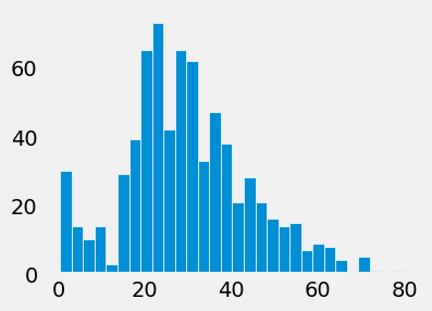
Comment/uncomment out the following lines of plt.style.use() to see how the example histogram change looks.
# plt.style.use('default')
# plt.style.use('ggplot')
# plt.style.use('bmh')
plt.style.use('fivethirtyeight')
# plt.style.use('dark_background')
# plt.style.use('fast')
titanic['age'].hist(figsize=(4, 3), bins=30, grid=False, edgecolor='white')
<Axes: >
To see all the available styles/themes in the environment, use the syntax:
plt.style.available
['Solarize_Light2',
 '_classic_test_patch',
 '_mpl-gallery',
 '_mpl-gallery-nogrid',
 'bmh',
 'classic',
 'dark_background',
 'fast',
 'fivethirtyeight',
 'ggplot',
 'grayscale',
 'petroff10',
 'seaborn-v0_8',
 'seaborn-v0_8-bright',
 'seaborn-v0_8-colorblind',
 'seaborn-v0_8-dark',
 'seaborn-v0_8-dark-palette',
 'seaborn-v0_8-darkgrid',
 'seaborn-v0_8-deep',
 'seaborn-v0_8-muted',
 'seaborn-v0_8-notebook',
 'seaborn-v0_8-paper',
 'seaborn-v0_8-pastel',
 'seaborn-v0_8-poster',
 'seaborn-v0_8-talk',
 'seaborn-v0_8-ticks',
 'seaborn-v0_8-white',
 'seaborn-v0_8-whitegrid',
 'tableau-colorblind10']